liapela.com
Miami, FL

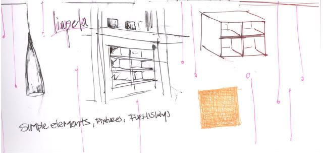
Liapela is another great baby store with products that appeal to parents who are environmentally conscious as well as fans of great design. This store is a little more less minimalist but I think that has allot to do with the size of the space. Modern tots seemed to be more open with higher ceilings. Liapela is trying to maximize their space showing as many products as possible. They even use furniture as a prop to display products so that they are getting a 2 for 1 out of the piece [ this is an idea that Suzanne recommended to me last week ]. I do like the fact that they use lighting in the shelving. This starts to create a more magical feeling, which I think is important in a kid store of any kind. The use of color on the back wall also adds a lot to the space. I still enjoy the minimalist feel of modern tots but I am starting to see elements in each space that would support my ideas in my space [although i still don’t have a concept : ( ]


No comments:
Post a Comment